


The ability to comprehend trading charts or to read price patterns is an indispensable skill for every trader. Without this skill, executing profitable trades becomes virtually impossible.
In this guide, we will delve into the essence of trading charts, their different forms, and the art of interpreting them correctly. Indeed, each type of chart serves the unique purpose of trading.
Some traders believe that a chart in itself provides ample information, negating the need for additional tools. Others, however, employ specialized methods for market analysis.
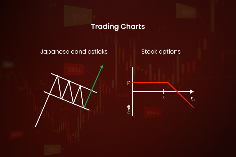
Trading charts
Trading charts are diagrams illustrating the fluctuations in the value of an asset over a specified period. Through these charts, one can not only see the price position but also its historical values and make predictions about its future movements.
Most experts agree that the market operates in cycles. This implies that an asset's value tends to replicate its motion after certain intervals. This cyclic nature enables traders to make predictions based on prior data, typically analyzed with the aid of specific technical indicators, which is why it is called technical analysis.
The concept of "timeframe" is widely used in trading. It indicates what each point on the chart corresponds to: a minute, an hour, a day, a week, and so on.
Timeframes can be long (or high), which usually encompasses periods from four hours upwards (like H4, D1, MN, Y). Short timeframes span from one to several minutes (like M1, M5, M15) and up to a few hours (like H1-H4).
Traders opt for various timeframes depending on the trading strategies they employ. However, it is not uncommon for a trader to use multiple charts with different timeframes for a single asset. A chart with a longer timeframe can be for analysis, while one with a shorter timeframe is used directly for trading.
Traders who lean towards long-term strategies often turn to charts with extended periods, like monthly charts. For medium-term strategies, weekly charts are frequently the go-to, and for short-term strategies, daily charts are the norm.
Types of trading charts
As mentioned earlier, charts vary depending on the selected time interval. But that is not the only basis for classification. Charts also differ in how they present information.
Charts can be depicted as simple lines, bars, or candlesticks, depending on a user's preference. Let's take a closer look at each type:
A line chart is the most basic representation of price changes. It is plotted as a simple line that reflects a single price value.
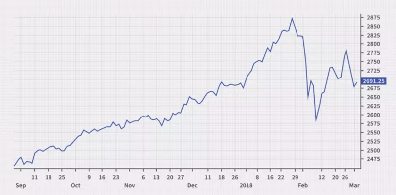
There are different opinions regarding the informativeness of this type of chart. Some traders find them to be less detailed, while others believe they help filter out market "noise," providing only essential information.
A candlestick chart is basically a representation of the price chart using Japanese candlesticks. It is considered to be the most informative type of chart. They are named so because the bars in this chart resemble candles with wicks.
A candlestick has a body – the main column that captures the opening and closing price within a given range. It also has shadows that mark the highest and lowest prices.
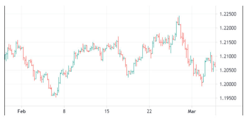
A bar chart provides almost the same information as candlesticks but looks slightly different. The top and bottom points represent the highest and lowest prices, while small horizontal lines to the left and right of the vertical line indicate the opening and closing prices, respectively.
Bars, like Japanese candlesticks, can also be differentiated using colors, but it is not mandatory as the location of horizontal lines is more important here.
A closer look at Japanese candlesticks
As previously mentioned, the price chart can be represented in various forms, with candlestick charts being one of the most popular among traders.
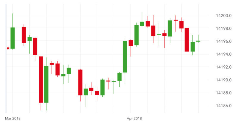
Each candlestick embodies information for a specified timeframe, be it an hour, day, month, or any other chosen period.
When you click on a specific candlestick on the chart, it will reveal the opening and closing, as well as the minimum and maximum price points that the asset reached within that range.
Additionally, you can glean more insights by observing whether the candlestick is hollow or filled and its color.
Hollow candlesticks indicate a price increase, while filled ones signify a price drop.
If the candlestick is colored white or green, it points to a price rise. Conversely, if it is black or red, it denotes a price drop.
The proportion between a candlestick's body and its shadows (wicks) is also crucial. Some candlesticks possess a long body with short shadows, while others might have a short or even non-existent body but long shadows.
A white candlestick with an elongated body indicates a substantial number of buyers in the market. If a long-bodied candlestick is dark, it suggests significant selling pressure.
In essence, these details about candlestick charts can offer traders invaluable insights into market dynamics and potential future movements.
At the same time, candlestick shadows can indicate that either bulls or bears are losing momentum. If initially, a candlestick had a long body that became shorter by the close of the session while its shadow became longer, this is a signal of a change in the market sentiment.
Bar charts in detail
Another well-known method for illustrating price charts of assets is the OHLC chart, also known as the bar OHLC chart. This chart type is most commonly used by traders from the US and Western European countries.
The name "OHLC" contains characteristics represented by each bar on the chart:
- O (Open): The opening price (depicted by the left horizontal line)
- H (High): The highest price (shown as the topmost point)
- L (Low): The lowest price (indicated by the bottommost point)
- C (Close): The price at closing time (represented by the right horizontal line)
In this case, the color of the bars is not of great importance. This is because the rise or fall in price is determined by the positioning of the horizontal lines (or notches) on the bar.
If the right (closing) notch is higher than the left (opening) notch, it signifies an increase in the asset's price for the specified period. Conversely, if the left notch is higher than the right one, it indicates a decrease in the asset's value.
The length of the bar itself is also significant. It represents the activity of the bulls (buyers) and bears (sellers). A short bar suggests that during the specified time, the asset didn't experience significant demand, implying minimal interest from both buyers and sellers.
On the other hand, a long bar denotes heightened interest from both parties.
However, it is crucial to understand that trading based on a single bar is not feasible. You need to confirm signals using technical indicators or chart patterns.
Interpreting bar charts
To extract comprehensive insights from a bar chart, one must understand how to read graphs.
For an accurate interpretation of a bar chart, you need to grasp the concept of the closing price (Close). The 'Close' price signifies the value at which the last trade was executed during the designated time frame.
This parameter can be instrumental in gauging the sentiment of market participants. If the 'Close' price is lower than the 'Open' price, it suggests a bearish sentiment among traders. Conversely, if the asset's final value exceeds its initial value, it indicates bullish sentiment.
Often, the 'Open' price for a new period aligns with the 'Close' price of the previous period. However, if there is a substantial difference between these two values, a price gap appears on the chart.
A sequence of smaller-sized bars typically indicates market instability and the potential for an imminent breakout. Conversely, a series of long bars reflects high market activity.
Much like Japanese candlesticks, bars can form specific combinations that signal a particular market scenario.
A prominent combination consists of three bars wherein the middle one is long and positioned between two bars with lower highs. Such a configuration suggests a forthcoming increase in the asset's price.
The same pattern, but with opposite values, indicates a likely price downturn.
Analyzing charts
Apart from reading bars and candlesticks on a chart, traders also use other methods to interpret how to read a stock action or other trading instruments.
First and foremost, before making any trading decisions, we must define the asset's price condition: whether it exhibits a clear directional movement or remains stagnant which is often termed as trading flat.
When the asset's price has a distinct upward motion, it is conventionally called a bullish trend. This can be seen when the chart shows progressively higher highs. Conversely, if the price steadily declines, a bearish trend is observed, characterized by increasingly lower lows.
If the price shows minor fluctuations within a specified range and lacks a definitive movement in any direction, such motion is labeled as "sideways" or "flat."
Moreover, by drawing a line connecting the highest and lowest points on the chart, two parallel lines called support and resistance levels can be built.
Furthermore, the price movement itself can form specific chart patterns. Some of these patterns signal the continuation of the current trend, while others indicate an impending reversal.
Patterns often receive names based on their resemblance to familiar shapes or concepts. For instance, trend continuation patterns include the "pennant," "wedge," and "flag." Reversal patterns include "double/triple bottom," "diamond," "head and shoulders," and others.
Chart analysis based on technical indicators
One of the most prevalent tools for market analysis is the use of technical indicators. While some are applied directly onto the main chart, others are displayed in separate windows.
Selecting the best indicators for 1 minute chart, such as the 1-minute, 5-minute, hourly charts, and others, helps traders determine the asset price's direction and potential reversal points.
All technical indicators are categorized based on their function. The two primary categories are trend indicators and oscillators, with two sub-categories for volume and channel indicators.
As their name suggests, trend indicators help identify the direction in which the price is moving. The moving average serves as the foundation for the vast majority of indicators in this category.
In contrast to trend indicators, oscillators perform best when the price remains within a specific range. They help define potential trend reversal points and highlight overbought and oversold asset areas.
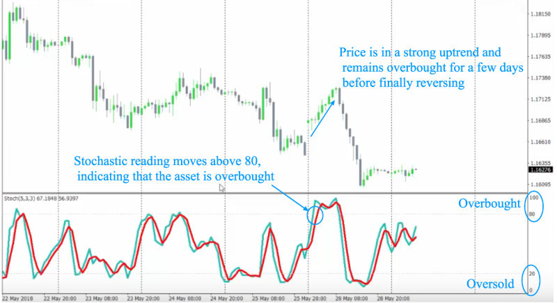
Being "overbought" implies that an asset's price has surged too high in a brief period, and a decline is anticipated. Conversely, an "oversold" condition suggests a sharp price drop, after which a rise is expected.
Experienced traders often stress that no single technical indicator can provide an objective market view on its own. All indicators are inherently subjective, boasting both strengths and weaknesses.
For this very reason, traders are advised to employ multiple indicators on a single chart. Moreover, these indicators should belong to different categories. In doing so, they either confirm or filter out each other's signals, enhancing overall analysis reliability.
Chart analysis based on Japanese candlesticks
As mentioned earlier, the mere presentation of a chart in the form of candlesticks provides comprehensive information for traders. Hence, analysis is not just limited to using indicators or graphical patterns.
Japanese candlestick charts are analyzed through the combination of various candlesticks that follow each other. In some situations, even the formation of a single specific type of candlestick can signal a reversal.
You can analyze candlestick charts on any timeframe, starting from a 1-minute interval. However, it is advisable to search for patterns on charts with time intervals of one day or longer.
On higher timeframes, signals appear less frequently than on lower ones but they are more reliable. Lower timeframes have a lot of price noise, or price fluctuations, and many false signals can emerge.
To confirm a signal obtained from a combination of Japanese candlesticks, experienced traders often recommend using one or several technical indicators.
Like graphical patterns, combinations of candlesticks are divided into two main groups: trend continuation patterns and reversal patterns.
Examples of the first category include "Three Black Crows", "Triple Strike", "Standoff", "Thrusting Line", and others.
The most intriguing group consists of candles signaling an impending trend change. These include Doji candlesticks, "Morning/Evening Star", "Hanging Man", "Inverted Hammer", and others.
Such unique names create vivid images and associations in the trader's mind, helping to better remember these candlestick combinations.
Recognizing combinations of Japanese candlesticks
To quickly navigate a candlestick chart and understand whether the trend will continue or reverse, it is vital to recognize the patterns formed by Japanese candlesticks. Find out how to read candlestick charts here.
We have touched upon the fact that even the formation of one particular type of candlestick can provide valuable signals. The Doji candles belong to this category: they have a very small or non-existent body and one or two long shadows.
If a Doji candle forms amidst a series of candles with large bodies, it deserves attention. It is likely pointing towards an imminent reversal in the current price movement.
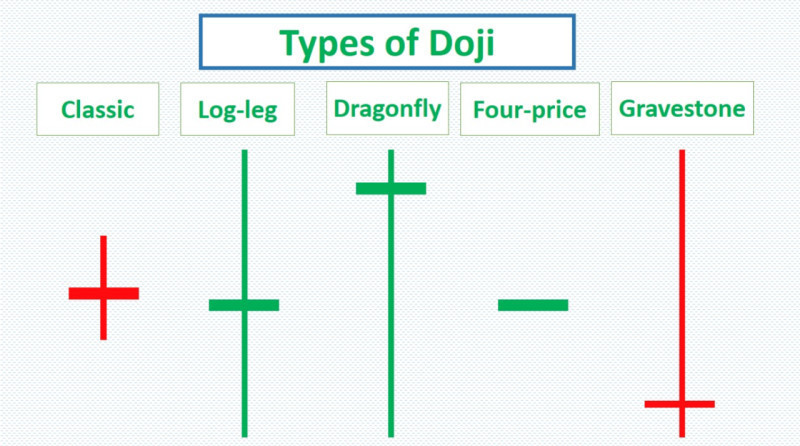
The Dragonfly Doji, which forms after a long dark candlestick, signals a reversal from a downtrend to an uptrend. The Gravestone Doji, which appears after a long white candlestick, indicates an upcoming switch to a downward trend.
However, it is unwise to make decisions based solely on one candlestick. It is essential to either confirm its signal using other analytical tools or wait for the formation of the next candlestick.
The Engulfing combination can be of two types: bullish and bearish. In the bullish scenario, a larger white candlestick seems to engulf the preceding dark candlestick with a smaller body.
This indicates a trend shift from bearish to bullish. In the bearish scenario, a dark candlestick with a larger body engulfs a white candlestick with a smaller body, signaling an expected trend shift from rising to declining.
There are many other combinations and individual candlesticks that help determine the future direction of the price. Traders need to be vigilant to spot them on the chart and make trading decisions based on received signals.
Difference between investing and trading
Market participants who prefer long-term strategies and can invest money over extended periods are typically called investors and their activity is known as investing.
Investment charts usually represent quotes of such assets as precious metals, stocks of major companies, bonds, and so on. This group encompasses various assets that can potentially appreciate in value and yield profits not in the short term but in the long run.
Data regarding asset price changes can also be displayed in other formats, such as tables. Using this method, one can compare an asset's price over one period relative to another period (e.g., weeks or months).
However, such displays make it challenging to discern the general direction of the price movement: whether its price is increasing or decreasing over time. It is the graphical representation that offers a comprehensive view, enabling decisions about buying or selling an asset.
In addition, investors use charts to conduct technical analysis on the assets in which they plan to invest their funds.
Beyond this, another form of analysis is employed when choosing assets for investment: fundamental analysis. This type of analysis entails assessing a company based on its financial indicators and also considers the impact of crucial events on markets in general and on specific securities in particular.
A significant aspect of long-term investments is the diversification of an investment portfolio. This helps minimize risks in the long run. If some assets yield lower profits or even losses, these can be offset with gains from other assets.
Stock charts
Currently, opportunities for trading charts and using trading platforms have become much more accessible to the general public than before. There was a time when data regarding quote changes was conveyed via telegraph and manually noted on a specific board.
Thanks to the Internet, you can now check the quotes of any trading instrument from home or anywhere else. Modern technologies have significantly simplified the lives of market players.
However, simply having access to online charts is not enough for successful trading. You need to understand how to read stock charts and interpret the information derived from them.
To grasp what is happening on the stock exchange, it is vital to closely monitor the actions of buyers and sellers in the market. Their activities move asset prices when market participants are placing orders or halt this movement when they use limit orders.
For a more detailed view of market activities, there is another way to display price charts with the help of clusters.
Three critical categories to look for on the chart are:
- Emergence of significant buyers
- Emergence of substantial sellers
- How the price behaves when reaching the levels where buyers and sellers have appeared.
Points on the chart where a large concentration of market participants emerges or where major players appear are called clusters. They are typically highlighted using colors: green signifies a gathering of buyers, while red indicates an accumulation of sellers.
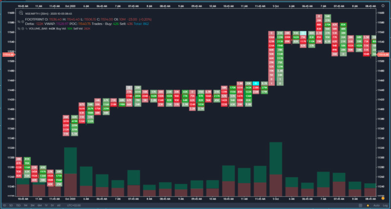
Consequently, clusters reveal the total volume of trades executed on a given timeframe. Another metric to consider is the delta, which equals the difference between the total volume of purchases and sales made in each cluster.
Through cluster analysis, you can precisely identify who currently dominates the market – sellers or buyers. Based on this information, decisions can be made about whether to buy or sell an asset.
Best charts for trading
All the charts we discussed earlier are constructed based on specific time intervals. That is, if you set a five-minute timeframe, a new point or candlestick is drawn on the chart every 5 minutes.
However, there is another type of chart that is built not according to time intervals but to the number of completed transactions – the tick chart. For example, on a 512-tick chart, each bar or candle displays information about 512 completed trades.
Notably, the volume of each completed transaction does not matter for this type of chart. A tick is counted for a transaction of 0.1, 10, or even 100 pips.
Such charts can be applied to any market but are typically used in the forex market. This is because Forex is a vast but decentralized trading floor.
Due to these two reasons, there is not any recording of transaction volumes in the forex market. Nevertheless, traders still need some information and they utilize tick charts for this purpose.
This type of chart is especially used by scalpers and other users who adopt short-term trading strategies.
Using tick charts is particularly relevant during periods of high market activity when many transactions occur. On a conventional chart, all these trades might fit into one candlestick or bar, whereas on a tick chart, new points or candles will appear as a specified number of trades occur.
To gain a more objective insight into market conditions, seasoned traders recommend using tick charts combined with volumes. In this case, both the number of completed trades and the points where a significant number of large transactions are executed will be displayed.
Bottom line
In this article, we have explored various types of charts and methods for studying and applying them. The simplest form of displaying quotes is the line chart but it provides limited information.
Bar charts and Japanese candlestick charts are more informative as they incorporate opening and closing prices, as well as the maximum and minimum prices for each period.
The choice of timeframe plays a crucial role in reading charts. Charts with shorter time intervals often present a lot of price noise, thus complicating analysis efforts.
Therefore, for analytical purposes, users often opt for charts with higher timeframes (from a 4-hour chart and above). Chart analysis can be conducted using patterns formed on the chart alone or with the aid of auxiliary tools, such as technical indicators.
Typically, no single analysis method is entirely reliable on its own. Hence, professional traders advise combining several trading styles.


