


Charts are believed to be among the most important tools for both traders and investors. They present the changes in the asset’s price in a very clear visual form.
Therefore, it is essential for users to know how to read charts and make good use of them. You can apply additional tools for this but you can also analyze an asset by just using the chart itself.
To learn more about different chart types, read the article Trading Charts.
How to read stock charts
In a nutshell, changes in the asset’s price reflect people’s behavior. Since human nature basically stays the same, we can assume that traders’ behavior will repeat itself over decades.
This is what the theory of market cycles is based on. Therefore, traders believe that proper analysis of quote records can help predict market developments in the future.
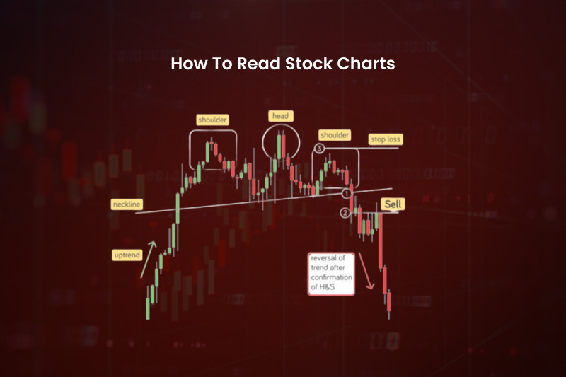
Thus, price movements on a chart can be analyzed with the help of graphic patterns. Some patterns are more common than others and can look alike.
To accurately detect a pattern, you need a certain level of experience and knowledge, especially when distinguishing continuation and reversal formations.
There are several approaches to trading patterns. The riskiest one involves opening positions right at the start of the pattern’s formation. Those who can detect a pattern at an early stage can get a hefty profit.
At the same time, entering the market at the start of the pattern’s formation can result in both profits and losses. The thing is that some graphic formations can be easily confused with other similar patterns.
Therefore, a safer approach suggests entering the market when the pattern has been completed. Besides, it is important to get confirmation from other indicators such as trading volumes, for example.
The disadvantage of pattern trading is the difference in perception which means that traders with different experience see different formations or don’t see anything at all on one and the same chart.
Stock charts
Trading charts are very useful tools as they show the current price of an asset and reflect its changes over time.
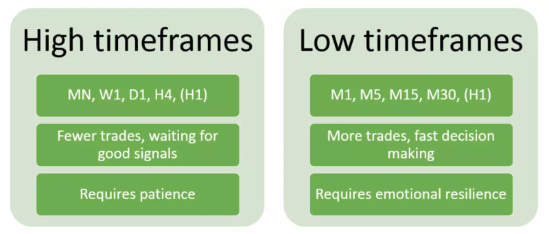
Modern trading platforms offer various time frames, ranging from minutes to several years. A user chooses a time frame depending on the trading strategy he/she adheres to.
Lower time frames are good for short-term strategies, while medium- and long-term strategies require the use of higher time frames, starting from a daily chart. Longer time intervals provide a bigger picture of the price movements.
The reason for this is less price noise which reduces the number of signals but makes them more reliable.
Lower time frames reflect more price fluctuations, thus generating more signals. However, most of these signals turn out to be false.
Short-term or day traders open multiple trades over the course of a single trading session. Each of such trades can bring a profit of several pips.
Those who play in the long term invest their money for a longer period and don’t expect to get immediate returns. However, before making an investment decision, you need to conduct a thorough analysis of the asset you want to invest in. This is where stock charts come in handy.
When reading a chart of a selected asset, an investor needs to track the changes over time and assess the asset’s potential.
However, technical analysis may not be enough for this. Investors should also pay attention to fundamental factors that influence price dynamics.
Fundamental analysis
This type of analysis is used to evaluate the current price of an asset and to forecast its potential growth. It is based on a number of various factors.
The main goal of such analysis is to identify whether an asset has been under- or overvalued. Underpriced assets are those that are trading low at the moment but have some upside potential. These are the assets to buy.
Overpriced assets are trading too high, and the main strategy here is to get rid of them as they have already reached their peak levels.
Keep in mind that the current market value does not always coincide with the real price. It is believed that the market will get closer to a fair price only in the long term.
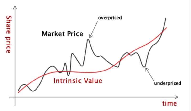
That is why investors assess the real value of an asset based on the company's financial results and other factors. If the current market value is lower than the real one, it is the right time to buy an asset as it has room for growth.
In case when the current price is higher than the real one, its growth prospects are vague. So, it is better to avoid such an asset.
Fundamental analysis allows investors to evaluate the financial performance of the company in the sector it belongs to. It also takes into account political and economic factors that influence the asset’s value.
Fundamental analysis is very popular among portfolio investors and financial analysts. Investors need it to choose better options for their portfolios, while analysts make recommendations based on the fundamental data.
When building an investment portfolio, it is essential to consider diversification. In other words, a portfolio should include assets with different risk/reward ratios. In this case, if one group of assets brings losses, others portfolio components can make up for them.
How to read stock charts
An asset chart can be represented in different forms. For example, it can be drawn in the form of a line which makes it a linear chart.
This is the simplest way to depict information. A line chart uses only a closing price on different time frames, starting from 1 minute, 1 hour, and higher. It is often used to check the real-time price of an asset as it is quick to update.
At the same time, the data on the line chart is not sufficient for in-depth analysis. Traders usually refer to it to reduce noise from other indicators and patterns.
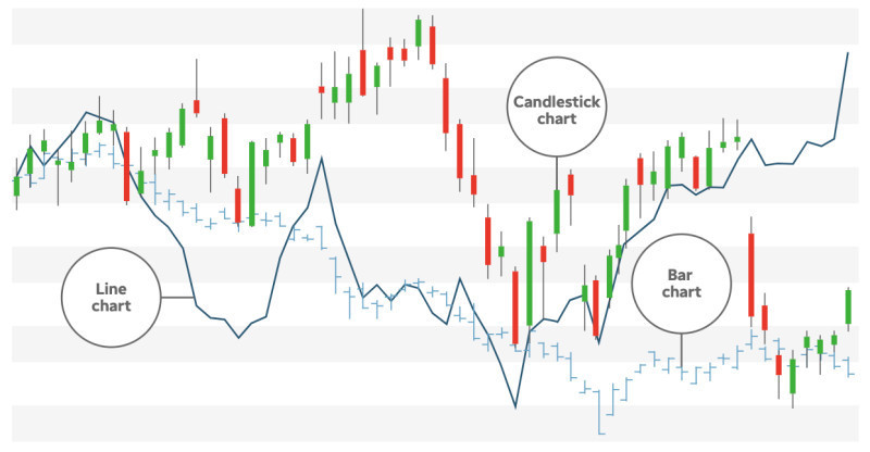
Other chart types are more informative than line charts. We are talking about candlestick charts, cluster charts, bar charts, and others. Let’s discuss what exactly these charts show us.
Bar charts are very similar to candlestick charts. Each element of a chart shows the high and the low of the price in a specified time period, as well as the opening and closing price.
The difference between the two types is that a bar chart has small vertical lines that show the open and close of the price, while a candlestick chart has a body and shadows to depict these changes.
Besides, candlesticks can be of different colors. Thus, when turning green or white, they show a rise in the price, and when turning red or black, they indicate a decline in the quotes.
To get even more information, traders can turn their sights to cluster charts.
Clusters reflect the volume of opened buy or sell trades in a certain time period. Buy positions are marked in green, while sell positions are colored in red.
Such visualization allows traders to see whether short or long positions prevail in the market in terms of the trading volume. Besides, cluster charts also reflect the dominance of either bulls or bears.
What to look for when analyzing stock charts
To analyze stocks, you can utilize various technical indicators. Professional traders prefer to deal with 4 main indicators:
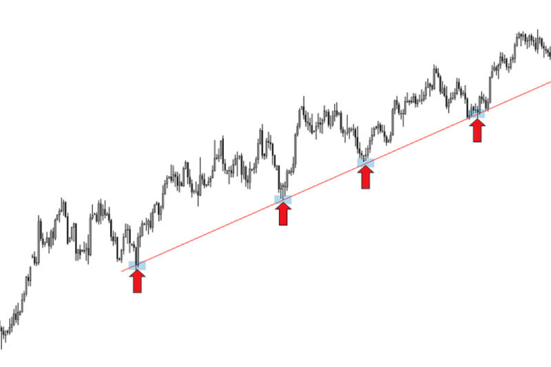
1. A trendline shows whether the price of an asset is falling or rising over time. If this line is moving upwards, then the asset is trading in an uptrend. Conversely, if the line is moving downwards, we are dealing with a downtrend.
The price curve does not always move in sharp swings. Sometimes, it is simply moving within a certain channel. This trajectory is called a flat or a sideways movement.
Yet, there are moments when the price is going through sharp and strong fluctuations. When this happens, traders do not rush to buy or sell an asset. Firstly, they look for more clues and monitor the market situation, including financial reports and economic news. This way, they can make a weighted decision.
2. On every chart, you need to define support and resistance levels. Support is the lower boundary below which the price is unlikely to fall. Resistance is the upper line that the price cannot break.
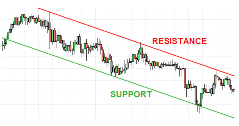
Support and resistance lines help determine when to buy or sell an asset. When the quote hits the support line, this is a signal to buy, and when it reaches the resistance line, it’s time to sell.
3. Dividend payments. Apart from the growth potential of a security, investors should also consider whether the company pays dividends to its shareholders.
New and fast-growing companies invest all their profits into further business development and, therefore, they don’t pay dividends. Larger long-established companies usually pay dividends once a month or once a quarter. This is a passive source of income for investors.
To attract more investors, some companies declare a stock split which increases the number of the company's outstanding shares. Such measures are taken to boost the stock’s liquidity and attract new shareholders.
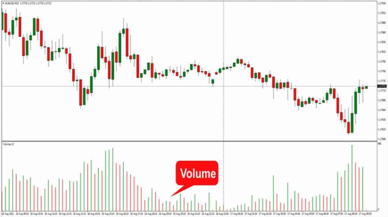
4. Trading volumes indicate the total quantity of sell or buy contracts traded for a specified security during a set period of time. Volumes usually depend on large market players, that is, institutional investors.
Retail investors monitor the situation that is shaped by large market players and evaluate the asset’s potential. If trading volumes increase, the price of an asset is set to rise. By contrast, a decline in trading volumes signals a future drop in the price.
How to use charts for investing
When making financial decisions, investors should pay attention to certain aspects that can be read on the charts.
One of the factors to consider is how other market participants evaluate the state of the stock issuer. Oftentimes, investors buy stocks and hold them for a long period of time but forget to monitor the situation in the market.
If the price of a stock is declining, this can be a warning sign that the company’s business is not doing well and its growth potential is limited. To track these changes, use higher time frames starting from 6 months and longer.
Volatility also matters. For traders who earn on short-term price changes, volatility should be as high as possible since it creates more opportunities for winning trades.
When it comes to investors, they should stick with the assets with low volatility levels. If shares plunge unexpectedly and an investor is too emotional about this, this is not a good outcome for the entire investment plan.
As a rule, bar and candlestick charts show such fluctuations very vividly. If the difference between the low and the high of the price is big, bars on the chart become longer.
If investors observe such a setup on the chart, they will most probably leave this asset aside.
The third criterion is the liquidity of an asset which can be defined through trading volumes. Higher volumes mean more liquidity.
Liquidity makes it possible to quickly sell an asset with great profit during high demand. Every investor should have such an asset in his/her portfolio as this allows them to quickly get cash if needed.
Symbols of financial instruments
Each chart shows a change in the value of one trading instrument. Different assets are traded in different markets. Thus, currency pairs are traded on Forex, stock and bonds are traded on the stock exchange, while oil, precious metals, and other commodities are traded in commodities markets.
The name of an asset on the chart comes in an abbreviated form. There are some common abbreviations in capital letters that denote certain assets.
For example, in currency abbreviations, the first two letters stand for the country name and the third letter corresponds to the currency name: USD (United States + Dollar), CAD (Canada + Dollar), GBP (Great Britain + Pound).
Company names are abbreviations that include several vowels and consonants. They are called tickers and are written with a sign: AAPL - Apple, MSFT - Microsoft, BA - Boeing.
When it comes to currency pairs, they consist of abbreviations of both currencies written together or with a slash. The first currency in a pair is the base currency, while the second one is the quote currency. The base currency is the traded currency and the quote currency is the one that denotes its value.
For example, in EUR/USD, the euro would be the base currency and the dollar would be the quote currency. So, here, the cost of the euro is shown in US dollars.
More about time frames
Time frames, or time intervals, are displayed on the chart with Latin letters and one or more numbers. So, the following abbreviations are accepted: M - minute, H - hour, D - day, W - week, MN - month.
As a rule, the name of the trading instrument in the information line of the chart is followed by the selected time frame code: H4, M15, D1, and so on.
Accordingly, if we consider a 15-minute time period, the data on the chart will appear every 15 minutes. In the case of a line chart, one curved line will be drawn.
In the case of Japanese candlesticks or bars, each of its elements will contain information about the open and close of the price as well as the high and the low for a given period of time.
As we have already noted, the choice of the time frame depends on the strategy a trader uses. However, sometimes, volatility also needs to be considered.
The quote of a more volatile asset changes with higher frequency. Therefore, such assets require the use of shorter time intervals as they will reflect even the smallest price fluctuations.
However, for less volatile assets, there is no need to use short time frames as they will look like they are trading flat all the time.
For instance, the value of a stock may show significant changes over a year or even several years but definitely not a few minutes or hours.
Therefore, when analyzing securities, investors often choose higher time frames to see a more complete picture of how the value of an asset has changed over time and whether it shows constant, sustainable growth.
What time frames to choose
As we have mentioned above, higher time frames provide a bigger picture of price changes as they eliminate price noise created by small fluctuations.
Moreover, there is no sense in trading stocks on lower time frames as they won’t show any significant movements, and the asset will be simply trading flat on a 1-minute, 1-hour, or daily chart.
Experienced investors check the dynamic of a stock on longer time intervals, for example, on a monthly chart. There are several reasons for this.
First of all, the signals on longer time intervals are considered to be more reliable. In addition, the patterns formed on such charts are more likely to be accurate.
Secondly, when using candlestick charts, the combination of candles on higher time frames also gives stronger and more reliable signals.
In any case, when using different time frames, it is better to follow the rule: start with higher time frames and finish with lower ones.
Therefore, beginners are not recommended to use a time frame shorter than 4 hours. In general, the D1 chart is believed to be ideal for both medium- and long-term trading.
You need to check this chart once a day after a close of a candlestick or a bar. This approach is perfect for those who have trading as a side hustle.
More experienced traders often use several time frames for one asset at the same time. They use a lower time frame to find the best entry points.
Principles of stock chart analysis
There are some basic principles you need to know to be successful in long-term investments. We have outlined them below:
1. Everyone needs to know how to read charts. This skill is vital for both day traders who use short-term strategies and investors who have a longer time horizon.
2. Traders need to analyze charts to make a correct decision on whether to buy or sell an asset at a particular point in time. For those who prefer to hold funds for a longer time, charts are needed to assess the growth potential of an asset and evaluate its behavior in the past.
3. Besides, charts provide information about volatility and liquidity of an asset. Investors can also use them for performing technical analysis with patterns and indicators.
4. Charts are the easiest way to visually represent changes in the price of an asset. This can also be done with the help of tables. Yet, even the simplest line chart will show more information in a more convenient form. Use this data and learn how to get the most out of what you see.
5. Combine technical and fundamental analyses. Both methods are important when choosing an asset for the long term and adjusting your investment portfolio later on. Technical analysis allows you to project price movements, while fundamental analysis helps you understand the reasons behind such price behavior.
6. Every chart type has its pros and cons. Select a chart that best suits your needs. A line chart provides less information but removes unnecessary data and shows a simple snapshot of a price. You can also apply additional indicators to it without creating confusion.
7. Bar and candlestick charts offer much more information than line charts. Candlesticks can be used as a separate analysis tool. Their combinations may indicate a continuation or reversal of the trend. Therefore, it is important to know the basic combinations and to promptly spot them on the chart.
8. Give preference to charts with higher time frames. Thanks to removed market noise, they show a bigger picture and generate more accurate signals.
Conclusion
We have discussed the main features and use of how to read stock charts. Charts for long-term and medium-term strategies differ from those used in short-term trading.
Those who trade stocks prefer Japanese candlestick charts as they show sufficient information about the price trajectory in a certain period of time.
When trading stocks, it is better to consider time frames starting from the 4-hour chart. A daily chart is an optimal decision for traders as it needs to be checked just once a day at the close of the trading session.
Investors also use charts to check volatility and liquidity of an asset. High liquidity makes it possible to quickly sell an asset with gains if this is required.
In addition, stock charts allow you to see how other market participants behave. Combining this data with fundamental analysis, you can understand why the price is moving this way and for how long this trend may continue.
For this, you should look for certain patterns on the chart that predict either continuation or reversal of the trend.
You may also like
How to read investment charts
How to read a stock action
How to read graphs
Best indicators for 1 minute chart
How to read a candlesticks chart
Japanese candlestick chart
Candlestick chart


