


If you are aiming to glean maximum insights into asset price changes, this is your go-to chart. It is no surprise that this chart has withstood the test of time and remains a top pick among traders.
In this guide, we delve deep into the nuances of Japanese candlesticks, their patterns, and how to interpret them proficiently.
Curious about other chart types? Read our article Trading Charts.
Weigh your options and select the one that aligns best with your needs.
Understanding candlestick chart
Traders often face a common dilemma: which chart should they use? The usual contenders are line, bar, and candlestick charts.
In a nutshell, while the line chart is the simplest, it falls short in terms of providing comprehensive information. This is because line charts primarily focus on closing prices. So, if you want insights into price extremes within a given time frame, the line chart will not do the trick. For a more in-depth analysis, it is wise to lean on bar or candlestick charts. Interestingly, candlestick charts present data more vividly than bar charts.
Here is what makes candlestick charts a top choice:
- They cater to all market participants, regardless of experience or skill level.
- They help identify patterns, making forecasting based on these patterns easier. In addition, the uniquely named patterns are catchy and hard to mix up.
- The effectiveness of candlestick analysis stands the test of time. These charts have been in use for centuries, originating from rice merchants.
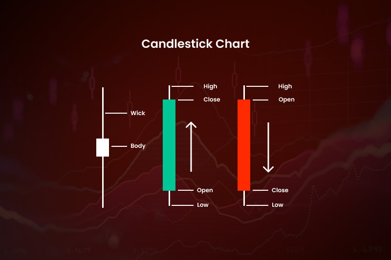
A candlestick represents a specific time interval set by a trader. For instance, if you choose the H1 time frame, a new candlestick will appear every hour.
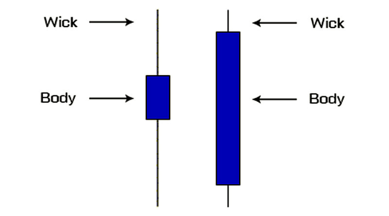
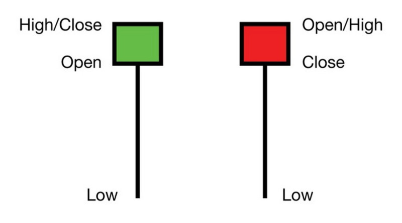
Each candlestick has several components. The central part is called the "body."
On the chart, this body can look like a rectangle, square, or even just a line (we will touch upon this later). The body captures the range between the opening and closing prices.
This body sets candlesticks apart from bars.
Let's say you have chosen the M5 time frame. At the start, an asset's price is 5 units, and by the end, it is 5.5 units. In this scenario, the bottom of the body aligns with the level of 5, and the top with 5.5.
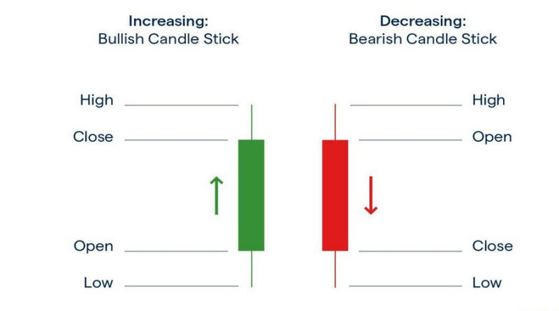
To make the price direction instantly clear, bodies are colored. If the trend within the period was upward, the body would be white or green. If the closing price is lower than the opening price, the body is black or red. Based on the colors, candlesticks are labeled as bullish or bearish respectively.
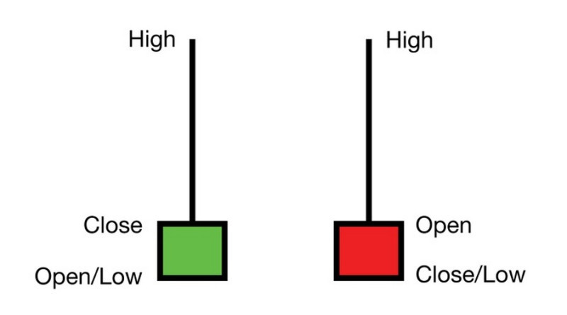
A candlestick has vertical lines extending above and below it. They are often called "shadows" or more commonly "wicks." These wicks represent the highest and lowest asset prices within the chosen period.
Revisiting our example, let's assume the price peaked at 5.6 units during the 5-minute time frame and dipped to a low of 4.9 units. The resulting candlestick would have its lower wick ending at 4.9 and the upper wick at 5.6.
In essence, each candlestick on the chart provides four distinct data points about the asset's price, offering a detailed view of its trend within the selected time frame. When you string these candlesticks together, you gain insights into the broader market trend.
Advantages of a Japanese candlestick chart:
- They provide traders with a wealth of information in a clear and concise format.
- They reveal market dynamics and volatility levels.
- They help gauge the sentiment of market participants - bulls and bears - showing who's in control at any given time.
- They offer insights into future price movements, helping traders find the best times to enter and exit the market.
- They highlight price gaps.
These charts are used in the forex, stock, cryptocurrency, and commodity markets.
However, Japanese candlesticks do have a notable drawback. They do not display price changes between the opening and closing.
For instance, they do not indicate the sequence in which highs and lows form.
How to read candlestick charts
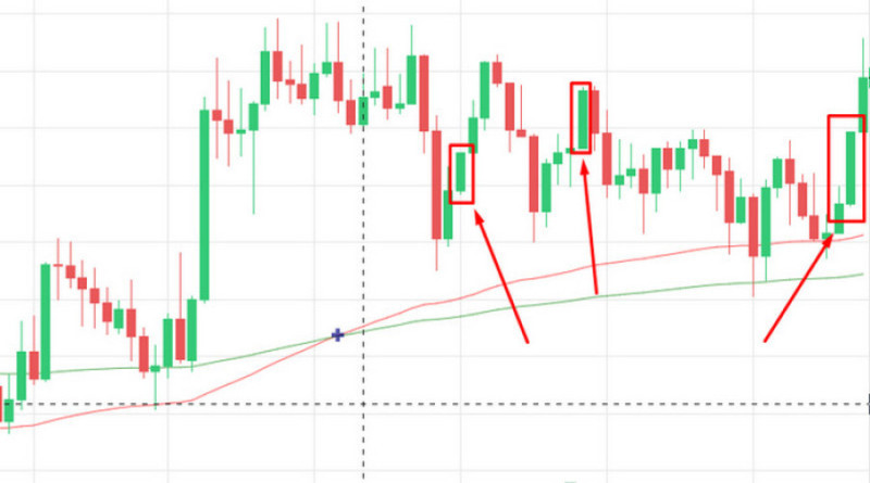
At a glance, you will notice candlesticks of different colors. Red or black candlesticks indicate that sellers, or bears, dominate the market.
On the other hand, green or white candlesticks signal that buyers, often referred to as bulls, are leading. The taller the candlestick's body, the stronger the influence of sellers or buyers.
Sometimes, you might see candlesticks with just a horizontal line instead of a rectangular or square body. These are called "doji" and suggest market indecision since the closing price equals the opening price. When a doji appears, it means neither bulls nor bears have significantly impacted the market direction. Often, such patterns emerge during overbought or oversold periods and usually hint at an upcoming reversal.
Another key aspect of candlestick charts is the shadows. Long shadows indicate high volatility, while short ones suggest trading was close to the opening and closing prices.
Sometimes, candlesticks lack shadows altogether. These are called "marubozu," where the highs and lows match the opening and closing prices.
Notably, it is important to consider time frames when analyzing candlestick charts. Charts ranging from M1 to M30 can contain a lot of market noise.
As you increase the time frame, the accuracy of trend direction and candlestick patterns tends to improve.
However, this does not mean short-term traders should not use Japanese candlesticks. They just need to be prepared for higher risks.
Principles of reading candlestick charts:
- Context and placement of elements matter. Always analyze each candlestick in relation to neighboring ones.
Pay attention to significant price levels. For instance, patterns formed near support or resistance levels have more weight than those in the middle of the chart.
- The size of the candlestick is important. Large candlesticks typically indicate a strong trend, while small ones can signal its potential end or reversal.
- Pay attention to the length of the shadows (wicks). Long shadows at support or resistance levels often suggest a looming reversal.
When the shadows are short or missing and the body is tall, it shows that the market participants have strong momentum.
- Consider the body's size relative to its wicks. A small body with long wicks shows market uncertainty. If there are no wicks, it suggests the asset is not capturing traders' interest.
A large body with long wicks indicates high activity, while short or absent wicks showcase the strength of the market players.
Candlestick chart patterns
We have previously outlined the general principles of reading candlestick charts. However, that was just the basics.
For a comprehensive candlestick chart analysis, understanding patterns or combinations of elements is vital. There are different ways to categorize these formations.
Classification 1 divides patterns into simple (consisting of a single candlestick) and composite (having at least two elements).
Classification 2 categorizes patterns based on the kind of signal they provide to traders. Patterns can indicate reversals, continuations of the current trend, or a shift to a sideways trend.
Now, let's look at some commonly used trading patterns:
1. Marubozu: This pattern comprises a single candlestick, which we have touched upon earlier. The Marubozu lacks wicks and signals the continuation of the current trend, indicating that market participants have the momentum to maintain it. A rising Marubozu suggests an ongoing upward trend, whereas a falling one indicates a bearish continuation. For signal confirmation, consider looking at trading volume or the MACD indicator.
2. Spinning Top: This is another pattern formed by a single candlestick. It is characterized by a small body and long shadows of equal length.
When this pattern emerges on a chart, it often hints at a potential trend reversal. The reliability of this signal significantly increases if there are multiple Spinning Tops.
3. Star Variations, which are reversal patterns. The Morning Star develops at the end of a bearish trend, often aligning with the support level.
Conversely, the Evening Star appears at the peak of a bullish trend or along the Resistance line. Each of these patterns comprises three elements, classifying them as composite.
The formation begins with a tall candlestick affirming the ongoing trend. For instance, if the trend is bullish, you will see a full-bodied bullish candlestick.
The second candlestick, usually separated from the first by a gap, has a small body. The third candlestick is a full-bodied one, but it moves against the previous trend. In this context, it is a downward direction.
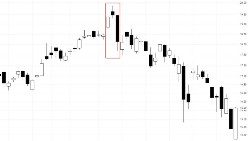
This information may give a sell signal. At the same time, the Morning Star signals potential buying opportunities as it often heralds the end of a downtrend.
4. Hammer is a reversal pattern made up of one candlestick. It can be bullish or bearish and has a lower wick at least twice as high as the body.
Bullish Hammer suggests an upcoming uptrend, whereas its bearish counterpart, often called a Hanging Man pattern, indicates a bearish reversal.
The Inverted Hammer also indicates a reversal but differs in the candlestick's body placement relative to its wick. The pattern can be either bullish or bearish.
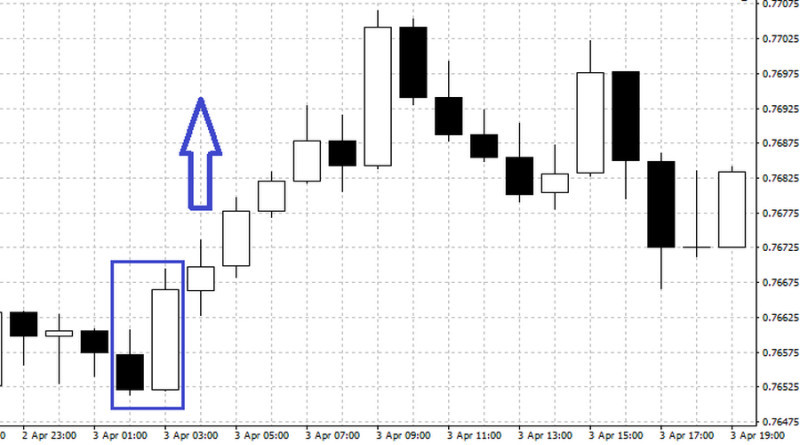
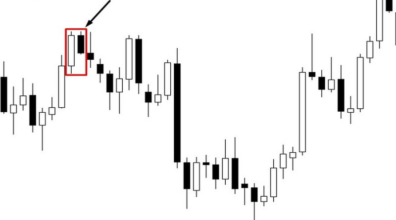
5. Engulfing warns of a trend reversal. It can be either bullish or bearish, too.
In the first case, the body of the second candlestick, which is rising, absorbs the first one, which is falling. In the second case, the opposite is observed, i.e. bears take the upper hand.
The reliability of this pattern increases when the second candlestick's size overtakes the first one’s.
6. Tweezers usually emerge after sustained movement, indicating its potential end. It is a two-candlestick pattern where the first confirms the ongoing trend, and the second opposes it. Their wicks are of the same length on the chart.
7. Three White Soldiers is a bullish pattern appearing during a bearish trend, consisting of three rising candlesticks. It often implies a probable bullish reversal.
Its counterpart, Three Black Crows, warns of a price drop with three falling candlesticks after an uptrend.
8. Dark Cloud Cover and Piercing Line are two opposing reversal patterns. The former involves a rising and then falling candlestick, often separated by a gap.
The second element closes around the middle of the previous candlestick's body, or even lower, typically signaling a reversal or correction.
The Piercing Line is the opposite of the Dark Cloud Cover, suggesting a possible bullish reversal.
Although many patterns have proven to be reliable tools in analysis, relying solely on their signals is not wise. It is better to pair them with other tools like support and resistance levels, moving averages, and other tools.
These tools can confirm and enhance the signals.
Features of trading on candlestick patterns
We have highlighted just a few patterns that traders can use, but the ones listed are the most common.
However, less popular patterns should not be underestimated in terms of effectiveness.
When working with any pattern, it is crucial to remember the following:
- Use additional tools for technical analysis, like the Relative Strength Index and the Stochastic Oscillator.
- Remember that candlestick patterns do not redraw over time. They provide consistent signals, which is a significant advantage.
- Factor in trading volumes when working with candlestick charts. Including the right indicators will help traders get a holistic view, thereby improving their trading efficiency.
- Japanese candlestick patterns are most effective on markets with gaps, making stock exchanges, where price gaps frequently occur between sessions, the ideal choice.
- On the forex market and cryptocurrency exchanges, gaps rarely appear due to 24/7 trading. This is why some models seldom occur here, while others, like the Engulfing pattern, appear regularly.
- The efficacy of these patterns has been validated by years of usage across various financial markets.
- The best time frames to identify and utilize candlestick patterns are H1 and W1. Day traders can identify models on higher timeframes and then switch to lower ones.
- Using indicators that function as scanners can help identify candlestick formations. This approach saves time, covers multiple charts and markets simultaneously, and offers historical signal usage statistics.
During trading, it is important to recognize that candlestick patterns are not flawless and have their downsides. Here are a few:
- False signals might appear on the chart. Charts continuously evolve, sometimes producing misleading patterns.
- Identifying patterns can be subjective. Different traders might spot varied formations on the same chart.
- Analyzing charts is challenging, requiring both additional tools and a grasp of the broader context.
- Trading based on patterns on short timeframes is risky. For instance, on M1-M5 periods, market noise can distort real data.
Experience shows that as traders grow their skills, they learn to reduce the risks associated with using candlesticks. Remember, every chart type has its drawbacks.
Conclusion
Candlestick charts serve as informative tools, offering the following benefits:
- They help analyze the market situation.
- They help predict an asset's potential price movement.
- They highlight ideal points on the chart to open and close positions.
However, do not be misled into thinking that using candlestick charts guarantees profitable trading.
Firstly, pattern identification always carries a level of subjectivity.
Moreover, working with any chart demands practice and an effective trading strategy. Only then can a trader's hopes for profit be realized.
You may also like
Best Indicators for 1-minute Chart


