


What is an open-high-low-close (OHLC) chart used for? How to trade it efficiently to get profit? Meet a full guide for traders who seek to get the most out of a simple chart.
When working with charts, every trader hopes to get as much useful information as possible. A bar chart is a perfect tool for this as it serves as a graphical representation of price changes and helps better analyze them.
In this article, we will discuss the advantages of this chart type and the best ways to set up and read it.
If you are looking for more information about various chart types, read our Trading Charts.
What is a bar chart?
Bar charts, sometimes called histogram charts, appeared in the 19th century. Since then, they have become even more popular and widespread than before.
Bar charts are highly informative and easy to read which makes them so popular among traders with different experience.
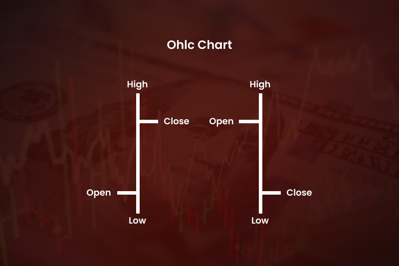
A bar chart is composed of a series of bars following each other. A bar is a vertical line that appears over a certain period of time indicated by a trader.
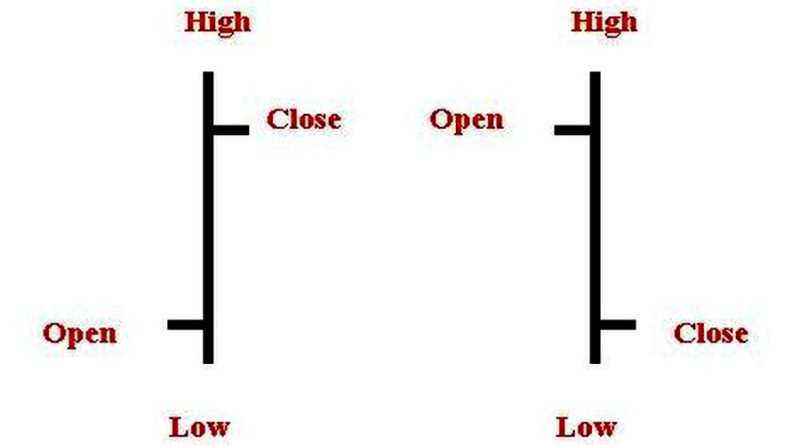
A bar has two short horizontal lines extending to the left and right of the vertical line. The horizontal line to the right marks the closing price (Close), and the line to the left represents the opening price (Open). The peak of the vertical line is the maximum price for the period, or the High. The bottom of the vertical line is the minimum price for the period, or the Low.
In Japanese candlesticks, the high and the low are represented by shadows while the close and the open are shown by the candlesticks' body.
There are two bar types:
- An inside bar is usually shorter than the previous bar;
- An outside bar is usually longer than the previous bar (the high of the current bar is above the high of the previous bar and the low is below the low of the previous bar).
In another classification, bars can be bullish and bearish. In a bullish bar, the close of the price is higher than its open. In a bearish bar, the situation is the opposite.
To make it simpler, the open-high-low-close chart is often called the OHLC chart.
The Y axis of the chart represents the price value while the X axis represents time. When the time frame set by a trader (an hour, a day, etc) is over, a new bar appears on the chart.
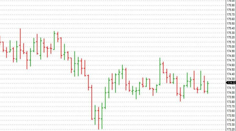
All vertical lines appear one after another, creating a setup that allows a trader to evaluate the market situation.
What bars can show you:
- Price gaps that occur mostly when the market opens the next day or when the market situation changes drastically;
- Price dynamics. If the line to the left of the bar is lower than the line to the right, this means that the price has gone up and vice versa;
- Market activity. When a bar is short, this indicates low market activity when both bulls and bears are idle. When the vertical line becomes longer, this shows stronger momentum.
Bar charts can be used to trade various assets, including stocks and currencies. So, it can be useful when trading on Forex or on the stock or crypto exchanges.
To reach a better visual representation, bars can be of different colors such as red or green. When a bar is colored red, we are dealing with a downtrend, that is when the Close is lower than the Open.
When a bar is colored green, the trend is bullish.
Colored bars allow you to quickly grasp the situation in the market. Typically, a number of consecutive green bars indicate an uptrend.
During a downtrend, you will see a number of red bars.
Depending on the selected time frame, bars can indicate a major trend or a short-term trend.
Pros and cons
With the help of a bar chart, you can get detailed information about price action for a certain time interval.
We are talking about time frames. For example, for a D1 time frame, the bar chart will display information about price changes that happened within a day. On the M15 chart, you will see changes that happened over 15 minutes.
Each new bar shows:
- the opening price;
- the closing price of the time frame;
- the highs and lows between which the price has been fluctuating in this time period.
So, on a bar chart, a trader sees a dynamic of the price and not only the statistical data. This is why price volatility can also be read on such charts.
The distance between the two extremum points is the height of the bar. If the bar is short, then volatility is low. If the line height is great, then traders know that the market is volatile.
You can also place support and resistance levels and trendlines on the bar chart. They are used to identify trend continuation and reversal patterns.
Besides, a bar chart reflects the price range. For example, if the distance between the high and the low is getting longer during a downtrend, this means that bears are putting pressure on the market.
If the distance is getting shorter, this indicates consolidation or even a breakout.
So, bar charts display the overall picture in the market. That is, they show whether the price has made a steep rise or fall in the given time period.
At the same time, bar charts are not so good for lower time frames. You should avoid using them for time intervals shorter than M5.
Another weak point of a bar chart is its visual representation. That is, it can be difficult to understand what is happening in the market right now when all the bars are of the same color. In this case, you may need time to distinguish a bullish bar from a bearish bar and analyze their horizontal lines.
When it comes to showing detailed data, bar charts are no worse than candlestick charts. However, they are less popular than the latter due to their visual peculiarities.
In practice, bar charts become easy to read when you get used to them.
Analyzing OHLC chart
When reading bar charts, traders resort to common techniques applied to other charts. The main goal here is to recognize certain patterns and based on this, make a decision on whether to buy or sell an asset or stay out of the market.
All varieties of bar chart analyses can be divided into two groups: patterns and trends.
1. Chart patterns are the basis of technical analysis. These patterns have been tested over time on historical price data and are used for predicting price movements.
The most common of them are Cup and Handle, Head and Shoulders, the Triangle pattern, and others. Let’s discuss them in more detail.
For example, the Head and Shoulders pattern signals a reversal in the bullish trend. The pattern consists of three consecutive peaks that occur during an uptrend.
The highest peak is called the head while the highs on the left and right are called the shoulders.
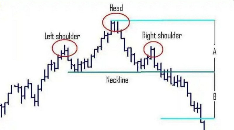
The pattern is considered complete when the price breaks through the neckline connecting the lows. In a conservative approach, a trade should be opened right after the breakout, especially if the breakout bar shows rising trade volumes.
In an aggressive trading style, a position is opened after the high of the right shoulder has been formed. A conservative approach implies entering the market after a pullback.
The Double Top and the Diamond patterns also predict a reversal. Such formations as a flag, rectangle, triangle, and others belong to continuation patterns.
2. A trend is the direction that the price is moving in. If the lows and the highs of the price are getting higher, this means that we are dealing with an ascending trend, or a bullish trend.
If the highs and the lows are getting lower, this is a bearish trend. There is also a sideways trend when bulls and bears have equal strength.
By connecting the descending lows, we can build a support line and by connecting the ascending highs, we will get a resistance level.
Trend trading strategies are very common among traders as they meet the optimal risk/reward ratio.
They can be applied to different time frames and are suitable for both beginners and professional traders.
Trend strategies in a nutshell:
- buy an asset during an uptrend, that is when the price is rising;
- sell an asset when the trend is bearish;
- take a break when the market is trading sideways.
These analysis tools allow traders to see the market situation from different perspectives in order to make forecasts and define the best opportunities for opening and closing trades.
What indicators to use
You can determine the trend direction and identify patterns on a bar chart manually. However, this requires a lot of time, skills, and expertise.
To make this process easier and to eliminate the human factor, traders use indicators. These algorithms do the routine work, thus helping traders make the right decision.
Below you will find the most popular indicators.
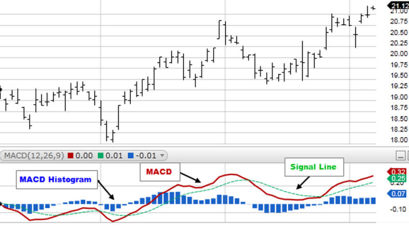
1. The MACD indicator measures the strength of momentum, combining the functions of an oscillator and a trend indicator. It shows the relationship between the Moving Averages of different periods.
As a rule, traders are looking for the so-called crossover when the MACD line meets the signal line. If the MACD line crosses the signal line from below, this is a bullish signal to buy an asset. If the MACD line crosses the signal line from above, it is the right moment to open a short position.
The MACD histogram is also used to indicate the overbought or oversold status of an asset.
For example, if bars are bullish and long but the price suddenly drops, this means that bearish pressure is increasing.
2. The RSI indicator measures the speed and change of price movements and predicts a possible reversal. The asset is considered overbought when the indicator is holding between 70 and 100 and oversold when it is holding below 30.
If an asset is overbought, its price is set to decline soon and vice versa when an asset is oversold. If the RSI crosses the level of 70 from above, it would be the right decision to sell an asset. If the RSI line crosses the level of 30 from below and moves upwards, this is a signal to go long.
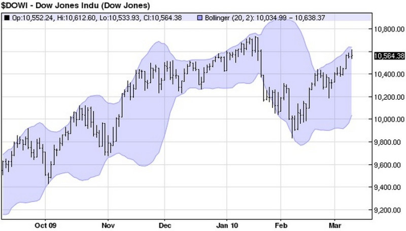
3. Bollinger Bands measure the volatility of the price. This indicator is also used for detecting a trend reversal or continuation, the area of consolidation, and extremum points.
The channel formed by the bands is widening as volatility increases and narrowing when volatility declines. The best moment to enter the market is when the price breaks through either of the bands.
For example, if the price breaks through the lower band, it is likely to increase further. When the price breaks below the upper band, it is expected to fall.
In addition to the above-mentioned indicators, there are various other indicators that can find reversal and continuation patterns on a bar chart. These algorithms analyze historical data, detect repeating patterns, and notify traders about them.
Given that patterns tend to re-occur in cycles, traders can make predictions regarding future price movements.
These algorithms include:
- Pattern Graphix is an indicator that can be added to MT4 as a plugin. Users can adjust the list of patterns and set up alerts;
- Autochartist is a similar indicator that can be used as a plugin or as a separate trading application;
- Pattern Alert is an algorithm that identifies patterns on the chart and gives sound notifications. Pattern Alert allows users to change the list of patterns;
- Autochartist recognizes patterns and draws price levels. It can also show changes in the price dynamics;
- Zup is an algorithm that finds patterns and informs users about the direction of an upcoming trend reversal.
There are a lot of indicators that are used in trading. Some of them are already built into trading platforms, while others need to be downloaded and installed.
There is no need to apply all these indicators to one chart. Excessive information on a bar chart can distract or even confuse you, especially if you are new to trading.
Bar chart settings on trading platforms
As a rule, trading platforms allow you to use different chart types. The most basic ones, the bar, the line, and the candlestick charts, can be found on every trading platform, including MetaTrader.
At the top of the MT4 platform on the Charts panel, you will find the buttons to switch between the chart types. The first button from the left shows bar charts.
By clicking it, you will see the OHLC chart of the selected asset.
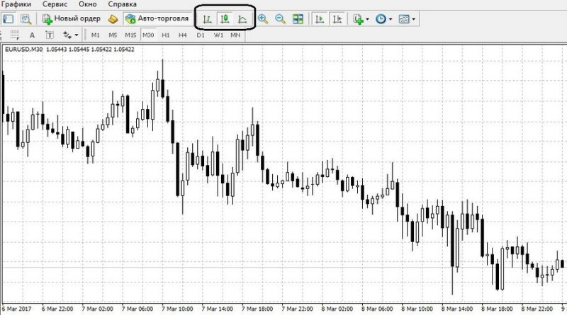
Once a chart type is selected, you can customize it based on your preferences via the Properties window.
For example, you can select the color of the background and axes, add volume histograms, and so on. All changes are immediately shown on the preview chart so that the trader can understand whether the chosen color suits him or not.
You can also use settings to:
- make the chart offline. In this case, the chart will stop showing new quotes until this feature is disabled;
- position the bar chart to the front so that all indicators and other analytical tools will be displayed below the price chart;
- choose a certain scale;
- add or remove grids;
- show or hide data on trading volumes;
- show or hide time frames;
- add or remove the Asc line;
- show or hide the info line;
- change time frames;
- create templates.
With MetaTrader, you can save the history of quotes in a separate document and print charts. Users can also go to full-screen mode and add several indicators to one chart.
Conclusion
A bar OHLC chart is a highly informative technical tool that facilitates the trading process and makes it more efficient. It provides information about price action as well as price gaps and price volatility.
Besides, bar charts can be combined with various technical indicators and patterns which helps increase the accuracy of forecasts.
Another advantage of this chart type is that it can be applied to almost any asset and time frame. You can use bar charts when trading stocks, currencies, and crypto with short-term or long-term strategies.
Both OHLC charts and the Japanese candlestick charts show almost the same data. When choosing between these two types, a trader should rely on his/her preferences.
You may also like
How to read stock charts
How to read investment charts
How to read a stock action
How to read graphs
Best indicators for 1 minute chart
How to read a candlesticks chart
Japanese candlestick chart
Candlestick chart


