


Any trader, regardless of their experience and achievements, uses graphical tools in trading. These tools help them evaluate the market situation, analyse price dynamics, and make a forecast.
Want to learn more? Read our complete review of Trading charts.
In this review, we focus on tick charts only. Read on to learn how this type of charts differs from others and what category of traders may find them especially useful.
What is a tick?
Ticks play a rather significant role in trading. They are the most informative tools when it comes to plotting a diagram of price changes.
When analysing ticks on a chart, a trader can define the current market situation as well as the past dynamics an hour, a day, a month, or a year ago. Besides, technical analysis tools enable traders to forecast future price movements.
Therefore, trading and charts are closely related. It is virtually impossible to trade without charts.
There are various types of charts that are classified in the following way:
1. The first classification is based on periods. A trader can analyze price action in a span of any time period, so different time frames are used in trading.
The choice of a time frame depends on the trading strategy. Specifically, day traders often use time frames ranging from M15 to H1, while scalpers prefer M1.
2. The second classification relies on the method of displaying graphical information. There are line charts, bar charts, Japanese candlestick charts, and tick charts.
The line charts are easiest to read. Japanese candlestock charts are the most informative ones. Tick charts can provide the most detailed information, because they reflect even the smallest price movements.
The smallest prices movements are actually ticks. It is the fact of a movement that matterns, not the number of points.
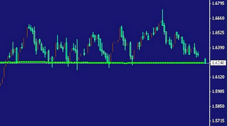
To explain the tick movements in more detail, let us provide a simple example. Suppose any cell in the image below is one pip.
The distance from A to B is one tick. As seen in the image, it equals 3 pips. The distance from B to C is 8 pips, but it is also one tick.
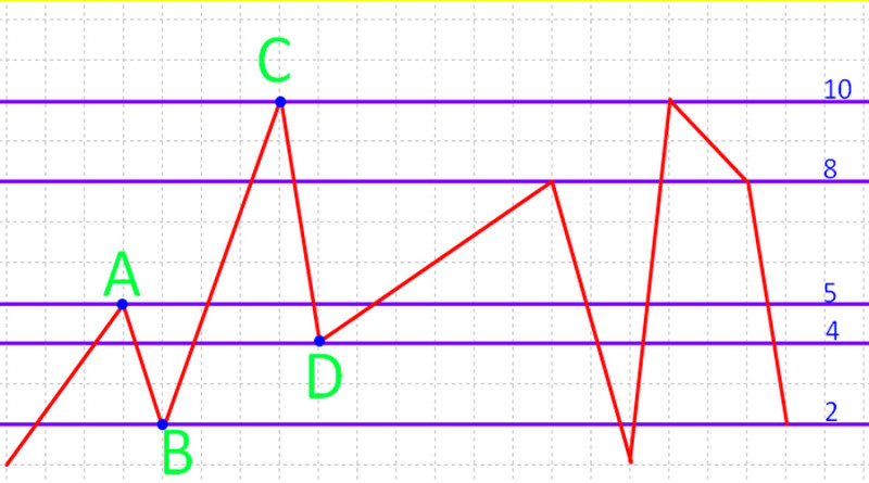
The concept of a tick is not related to time intervals. That is, time frames may vary depending on the activity of market participants. If we assume that each cell on the horizontal axis in the screenshot is a second, then the distance from A to B of 3 pips was covered in 1 second, while the way from B to C of 8 pips took 3 seconds.
However, in both cases we are refering to one tick.
Such a movement directly depends on the activity of traders. When the market activity is high, volatility is also high, so the chart looks like a zigzag.
When traders are more passive, the chart is more linear.
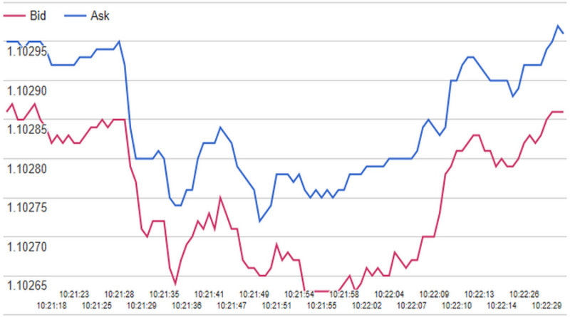
Tick charts are based on two prices: bid and ask. The difference between these prices is the spread.
Both prices most often change synchronously. However, there may be situations when Bid and Ask prices coincide or, conversely, the gap between them increases significantly.
At the same time, it is important to understand that ticks are formed based on completed transactions. For example, if one trader placed a buy order, then a sell order generated by another trader should be found for them.
As a result, an order will be executed and a tick will be formed. This is a classic scenario, if you do not take into account the specifics of the work of brokerage companies which serve as mediators.
In this case, traders' orders are executed within the company, i.e. they are hedged by counter orders from other clients or the broker itself.
Interpretation, specifics, and types of tick charts
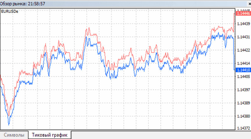
Visually, a tick chart often resembles a linear one. Generally speaking, the difference in the appearance of these two charts is that tick charts have no reference to time frames.
If there is any reference to a time period, it is provided merely for information. Tick charts are built solely on the fact of quotes moving up or down.
When quotes barely move and quite a few trades are made, the chart also seems to go still. When several trades are made at the same price, a chart moves parallel to the horizontal axis, and when the price changes, it rushes up or down.
A tick chart can also be presented as bars. Each bar can include one or more ticks.
The second option is advisable to use during periods of high volatility, when new bars are formed very quickly. In this case, it makes no sense to use bars containing only one tick, as there will be a lot of market noise.
Ticks grouped into bars allow you to focus on the most important information in trading.
Renko bars are the most popular ones. Also, there are candlestick and tic-tac-toe charts.
Basically, the type of charts we are desribing here is used in Forex mainly. This is the largest financial market with a daily turnover of more than $5 trillion.
Forex attracts a large number of traders. It is based on the over-the-counter structure (OTC). In this regard, it is impossible to calculate the volume of all completed transactions.
That is why the tick volume is used in Forex, while charts of the same name are used for its calculation.
There are the following types of ticks:
- Upward ticks - they indicate a price rise, so traders use them to place trades above the previous readings.
- Downward ticks point to a price decline.
- Zero ticks indicate that a price remained unchanged.
And here are the key features of tick charts:
- they make it possible to see all price changes with no exception, even slippages;
- they can be used to define support and resistance levels;
- they do not factor in the time frames, that is, the period of time. Intervals may vary depending on the activity of traders;
- they reflect only short-term trends;
- they are not suitable for predicting price changes in the long and medium term. Most often, they are used to evaluate market impulses at the current time;
- they cannot be used for technical analysis. The reason is that tick charts break the classic correlation between price and time;
- they can be used to detect local extrema. This is important when determining the optimal entry point.
Tick charts are not widely used, but they are valued by professional traders. The advantages of these charts are:
- The smallest possible scale that enables traders track all price movements.
- Accuracy: chart data can be used as signals to open or close trades.
- An objective assessment of the current market situation: traders can implement various trading ideas based on graphical information.
When plotting tick charts traders need to use the same data. Still, there are several types of graphical models. Let's briefly describe each of them.
- Proportional linear: it enables traders to track price changes in relation to the horizontal time axis.
- Disproportionate: this option is most common, as it does not imply a reference to time;
- Proportional, fixing spreads: all quotes are displayed linearly relative to the time axis. The bottom point is most often the ask price, the top one is the bid price.
How to set up and use tick charts
Tick charts are embedded in MetaTrader 4 and 5 platforms. In most cases, traders use these charts to find a correct entry point.
However, to streamline the operation of tick charts, traders need to adjust them. Those who use MT4 need to perform the following actions:
- Open the View tab, then go to the Market Watch window;
- Click Symbols where different chart types are presented;
- Select the Tick Chart option.
Users of MetaTrader 5 need to make basically the same steps. As a result, they will see a chart similar to MT4, but it will also show time frames.
Conventional analysis methods do not work here. If a trader wants to use indicators, they should installed in the platform separately.
The only type of analysis that is available in MetaTrader by default is the support and resistance levels analysis. It helps traders predict further price dynamics.
Besides, charts most often have internal settings. For example, a trader can choose the number of ticks that will be included in one bar.
First of all, traders need to factor in the specifics of an asset they trade. If it is characterized by high liquidity, 3,000 or 4,000 ticks can be included in one bar. It applies to forex trading.
When an asset is in low demand, it is reasonable to reduce the amount to 300-2000 ticks. But when it comes to scalping, the maximum bar count should not exceed 50.
When trading, it is important to understand that in tick charts, each new bar is created only when a certain number of trades have been made. If they were not, the chart remains barely unchanges.
This is the key difference from charts that are based on time frames. Traders often use this feature to reduce the market noice.
How does it work?
For example, during the premarket period, it takes quite a long time for new bars to appear, as traders' activity is low. Accordingly, if any trades are performed, there are very few of them.
Right after the opening of the session, bars are formed quickly and often. At this time, traders are actively making trades, which is reflected in a chart.
The time before market closing is also a period of high activity. At such moments it is possible to determine micro trends which are hard to be noticed on time charts.
Most often tick charts are used in tandem with the volume histogram. Since all the bars in this case are visually equal, the volume will show which changes in the price of the asset are supported by a large number of transactions and which are not.
As a result, we can conclude whether the smart money that drives the market has come into play, or whether it is just the actions of retail traders.
When using the volume data, a trader needs to know:
- Extremum volumes that can signal an upcoming reversal;
- The period of price decreases when this trend corresponds to high volumes. It means that the trend is short-term. On the contrary, if the volume is falling, the price movement vector can persist for quite a long time.
- In case prices grow along with volumes, the trend is likely to be short-lived.
Besides, tick charts help traders to check the ongoing situation on the market in the periods between trading sessions. Bars are formed during such periods, so they can carry important information.
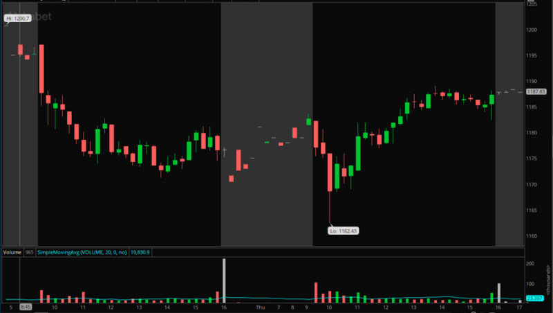
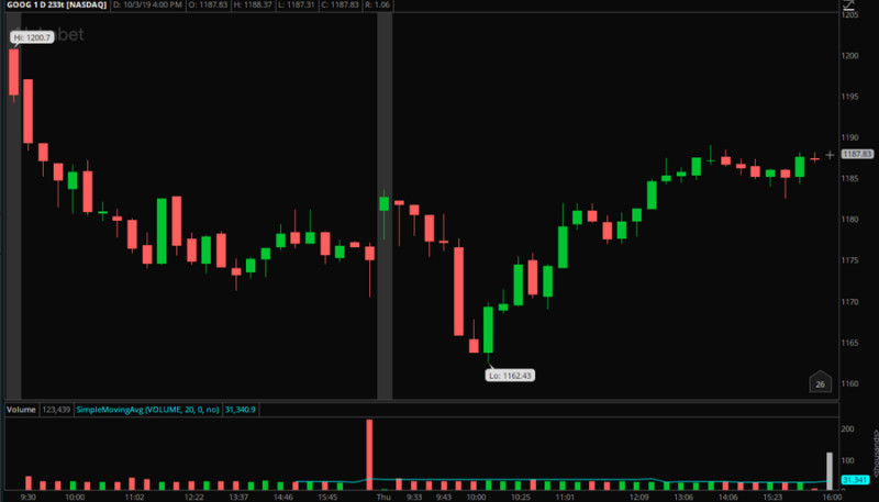
This is confirmed by the screenshots below. In the first image there is an M15 chart, in the second there is a tick chart. The break is highlighted in gray.
In addition, this type of chart helps to determine the probability of the current trend reversal. In this case, false continuation bars which actually reflect low trading volumes cannot mess the overall picture.
Most often, in such cases, an increase in volumes leads to a reversal.
You can use tick charts in both slow and fast markets. In the first case, they suggest even the slightest activity, and in the second, they make the adjustment easier.
Facts you need to pay attention to:
- Tick charts can solve various user tasks, which depend on the trading strategy. Specifically, scalpers use them to filter short-term market noise.
- When the trading activity is high, bars appear quite fast. It is very important to react quickly to the signal and make a prompt decision.
- Both scalpers and swing traders should use this tool to determine more accurate entry points.
- Tick charts make it easier to trade several assets at a time, while boosting its effeciency.
There are no perfect strategies based on the use of tick charts. First, this tools is efficient only if combined with other tools. Second, it is up to a trader to decide when and how to apply this type of charts.
As traders get more experienced in using tick charts, they can develop their own strategy that will meet their needs. As practice shows, beginning traders achieve no success when trying to develop such a strategy.
That is why tick charts are not very common in trading communities. They are used by professionals mostly.
How to read tick charts
Basically, tick charts can be interpreted in the same way as other types of charts. Traders just need to find support and resistance levels, determine the current trend, and find breakout points.
Chart patterns and numerous indicators are not usually applied on tick charts. When reading a tick chart, one should focus on the current market situation and an asset price.
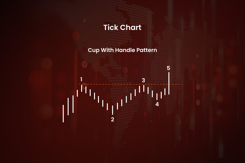
Let us provide an example. Suppose a trader uses a usual time chart where the Cup and Handle pattern is formed.
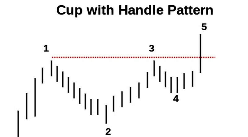
In this case a trader receives the following information:
- First, the asset price rises, reaching a new high.
- After that, the price pulls back but does not fall below the previous low because buyers appear on the market and their activity fuels further growth.
- The line tests the maximum, but it cannot break it, because sellers take control over the market.
- Subsequently, buyers gain the upper hand again, which leads to a breakout.
On a tick chart, it would be more difficult to forecast a similar development of the market situation. In this case, the revealed patterns would be random, not significant.
Importantly, it refers to small price movements, that is, micro trends, micro breaks, and so on. This means that for medium- and long-term trading, this information is of no use.
Only the current situation can be assessed. There is no use in looking for patterns in historical data or making long-term predictions.
It is also important to pay attention to the time factor.
In the screenshot, the highlighted zones reflect the same time periods of 30 minutes. But since it is a tick chart, the bases of the formed figures are of different lengths.
This is due to the fact that in the first 30 minutes the price changed more often because there were more trades. During the second half an hour, the market activity was much lower.
If a trader used a classical time chart in a similar situation, the bases of both rectangles would be the same.
At first, it may seem difficult to interpret tick charts. This is why this type of charts is not suitable for beginners.
When getting more experienced, a traders can make a good use of this tool, which helps them to understand how prices change, what role liquidity plays and how to avoid slippages.
What are the risks?
Tick charts provide certain advantages to intraday traders and scalpers. Nevertheless, their use in trading carries certain risks.
Here are the most important and significant ones.
- New chart elements appear too fast at moments of high market activity. In such situations, traders have very little time to react to signals and make decisions.
- Some tick charts are paid, so a trader should be ready for additional charges.
- Charts may contain inaccuracies, differing from one source to another. For example, sometimes bars do not include all ticks, which affects trading performance.
To reduce risks, a trader needs to follow these recommendations:
- Use tick charts in combination with other tools.
- Check the received signals on time charts.
- Select the options with the lowest spreads.
For example, a trader can determine the current trend, support and resistance levels using classical methods, while ticks data can serve as a supplement. At least it will increase the accuracy of entry points and help traders to avoid the market noise.
So, in the process of trading it is very important to ensure a comprehensive approach to the use of charts. Relying only on ticks is very risky, even if they are accurate and cost a lot of money.
In addition, trader's personal preferences also matter. If any particular tool is very difficult and unreasonable, traders need to consider whether they really need it.
Real examples
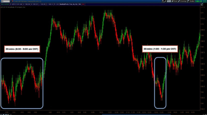
When the market activity is high, it can be difficult to identify micro trends using classical methods. Even if you select the M1 time frame, you can see only green or red candles on a chart.
In the left part of the screenshot, you can see that a trader tried to build resistance lines, but the overall picture at the end of the specified period is still not formed.
On the right there is a tick chart, where each candle consists of 2,000 ticks. In this case, a trader can plot a general resistance line.
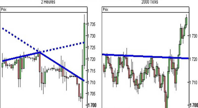
In the opposite situation, when neither bulls nor bears are active, a classic chart displays short candles that do not carry any valuable information.
Meanwhile, tick charts are not overloaded, because they have few elements.
This makes it easier and faster to determine the current trend.
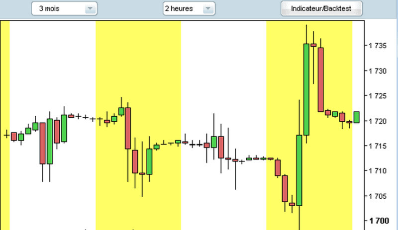
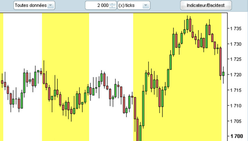
In the screenshots below, each trading day differs from the previous one in color, either white or yellow. In the first case, the chart is classic, the second one is a tick chart.
The first screenshot shows the same number of candles every day. In the second screenshot, the number of elements changes depending on the market activity.
Visually, the second option is more informative. First, there is no secondary graphical information, which allows traders to define the general mood of traders.
Besides, it simplifies the process of determining the current trend. It is important for planning trading steps.
Suppose a trader decides to trade some particular asset. For that, they use a time chart with M1 time frame and a tick charts of 100 elements.
In both charts, the price low is at 115.34 while the price high is at 115.8. Time frames are the same.
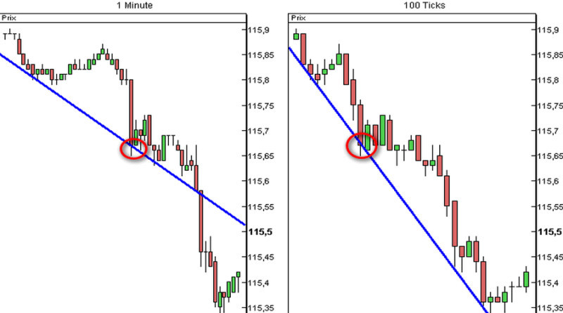
Alt: A tick chart on the right is more informative compared to the one on the left.
An asset price falls sharply at a certain moment highlighted with a red oval. In the first case, a long red candle appears, and in the second there are several short elements of different colors.
Based on it, a trader can find a short-term support line. As we can see, in the first and second charts these lines are different.
Let's assume that a trader sold the asset right after a decline began, taking into account the information from both charts. Such a decision was also confirmed by the market layout.
If a trader used only the first chart, he would have doubts: whether to expect a decrease or exit the market. If he did not dare to open a position, a profit would be lost.
Indicators
To simplify traders' work, developers have created special tick indicators. Their main purpose is to help traders analyze an asset price.
Here are some of such indicators:
1. LGP Tick Chart adds ticks directly on a price chart. It works offline, so the choice of time frame is not critical.
Based on personal preferences, a trader can set the following parameters: the color of elements and the number of ticks. The LGP Tick Chart indicator is shown in the screenshot below.
2. LGP Tick Save is an algorithm that simply saves the necessary tick data on each trading day in separate reports. By combining all the information, you can analyze the dynamics.
Most often, this indicator is used to test new tactics and strategies. This method of signal confirmation is considered quite effecient.
The disadvantage of LGP Tick Save is that it is rather complicated and time consuming. That is why beginners are not advised to use it.
3. Tro Tick indicator is almost identical to LGP Tick Chart. The only difference is that it enables users to plot a diagram based on ticks and launch a dialogue window.
4. Tick Smoother is also similar to the above described indicators but its specific feature is its ability to calculate moving averages based on ticks.
5. Equalizer is a tool that helps traders determine the market activity. Graphic signals inform users when this indicator is at its peak, and when it is normal or very low.
In the first case, red columns appear, signalling an opportunity to open a position as soon as possible. In other cases, the elements are green.
This indicator is not suitable for novice traders, as it requires prompt reaction when making trading decisions.
The described indicators can only serve to supplement the main analysis tools. They can help in making a decision about entering the market, but they cannot be considered independent tools.
Alone, these algorithms cannot be used to predict an asset price. They only provide an opportunity to comprehensively assess the current market situation. They can be useful primarily for scalpers who are more interested in quick filtering and confirmation of trading signals than other market participants.
Conclusion
Tick charts have a number of advantages over the classic ones. They open up new opportunities for traders, allowing them to quickly and accurately determine the current market dynamics and consequently find the optimal entry or exit points.
At the same time, the use of this tool carries certain risks. To be on the safe side, traders need to combine tick charts with classic ones based on time frames. Another issue is that tick charts are intended primarily for the use by professional market participants.
For beginners, tick charts are unlikely to be useful. On the contrary, such charts can add problems. This is a rather specific trading tool that requires an immediate reaction and deep knowledge in the field of trading from the user.
One should also remember about the short-term nature of tick charts. They can be effective when applied in intraday strategies and scalping. For medium and long-term traders, tick charts are not suitable.
You may also like
How to read stock charts
How to read investment charts
How to read a stock action
How to read graphs
Best indicators for 1 minute chart
How to read a candlesticks chart
Japanese candlestick chart
Candlestick chart


