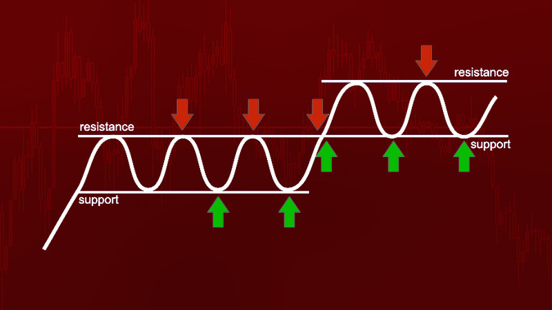
Finding support and resistance on the chart is one of the key skills every trader should have. These levels can be very clearly visible on the chart. However, it can sometimes be quite difficult to identify them.
In this article, we will discuss how to accurately detect support and resistance in any situation and on any chart. We will get an insight into the basics of establishing these levels and other related issues.
To learn more about trading with support and resistance, the existing strategies, and the pros and cons of this approach, you can read the article " Level Trading."
Graphical vs Indicator Analysis
The success and profitability of each trade largely depend on the way market analysis is conducted. Let's take a closer look at the main groups of analytical tools and how they can be used in practice.
Graphical analysis is one of the common analytical methods that emerged a long time ago. It is based on the visual perception of the chart by the trader, without the use of additional tools.
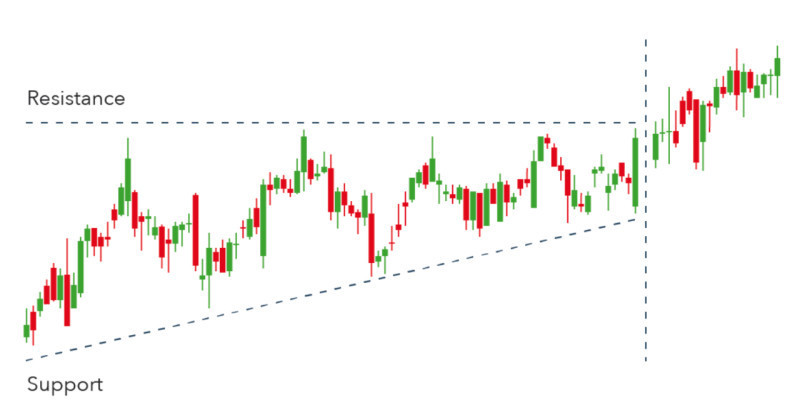
It is based on the following ideas:
- Identification and plotting of support and resistance
- Detection of graphical patterns
Finding and identifying support and resistance levels allows you to see the range of price fluctuations over a selected period of time. Graphical patterns help detect potential reversal points or a trend continuation.
Indicator analysis includes more complex tools, each of which is based on specific calculations or mathematical formulas. The essence of all indicators lies in a certain consistency of market movement that has been derived and transformed into a formula.
The widespread use of such sophisticated tools became possible thanks to the development of computer technology. Nowadays, all calculations are performed by computers automatically and take mere seconds.
Currently, it is quite difficult to find traders who adhere to only one analytical method. The tools belonging to both groups often complement each other.
It is the combined use of multiple tools in a single trading strategy that yields the best results. For example, when a user struggles to make a decision using elements of graphical analysis, adding one or more indicators can provide a clearer picture.
Functions of Support and Resistance
Any asset moves according to certain patterns. Each high and low occurs as a result of the battle between the bulls and the bears, i.e., buyers and sellers.
This continuing confrontation in the market constantly disrupts the supply-demand balance for a particular asset. However, if demand always equaled supply, the asset's price would never change, and there would be no fluctuations on the chart.
It is quite difficult to imagine such a scenario. Even during sideways phases, there are fluctuations on the chart, albeit of significantly smaller amplitude than during trend movements.
When the price starts to increase, the number of traders willing to purchase an asset gradually drops to zero. In such a situation, sellers are forced to lower prices, and a high is formed on the chart, creating a resistance level.
During a price decrease, buying demand for an asset increases, but the number of sellers gradually decreases to zero. At this point, buyers begin to raise the price at which they are willing to purchase, and a swing low is formed on the chart, creating a support level.
Support and resistance are key tools in graphical analysis. They can be used in any trading strategy, for any asset, and in any time frame.
For some users, these lines serve as reference points and help them see the overall picture of what is happening in the market. Others use them to determine entry points.
This tool works because a large number of traders believe in these levels and trade using them. For this reason, they often get tested although occasional breakouts through these levels occur.
Breakouts
Accurately drawn support and resistance levels are strong reference points for traders. However, as mentioned earlier, breakouts through them may occur.
In most cases, the price moves between certain lines for a prolonged period of time. It approaches these lines, may touch them, and bounces off, continuing its movement in a reverse direction until it reaches the opposite boundary.
If the boundaries are drawn correctly, numerous touches to these lines on the chart confirm their strength. However, this does not last indefinitely.
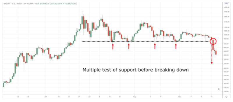
There comes a moment when the price of an asset breaks through one of the levels and continues its movement in the same direction. If this boundary is strong, a steep movement is required to make the breakout.
Often, the price is as if preparing to make a breakout through one of the levels. This can be seen on the chart when certain graphical or candlestick patterns appear.
For example, a sequential formation of larger and larger candlesticks of the same color may indicate the strengthening of a dominant trend and a potential breakout.
In addition, important economic and financial releases can serve as a trigger for strong price momentum. Immediately after the publication of important data, the price will instantly show this on the chart.
Another sign of a possible breakout can be price movement within a relatively narrow range, known as consolidation or a flat. For some time, the price moves between the boundaries of a corridor but may eventually break out.
How to determine support and resistance
There are several ways of identifying and plotting support and resistance on the chart.
1. The simplest and most common approach is drawing levels through swing highs and lows. The more times the price touches these lines on the chart, the more reliable they are.
2. Building levels based on the open and close prices of the previous trading period is more relevant for intraday trading. These boundaries can act as support and resistance for some time after the beginning of a new trading period.
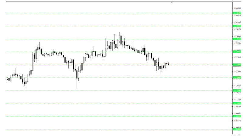
3. Boundaries can be identified based on the so-called psychological levels that are easier for users to perceive.
4. Support and resistance can also be determined with the help of levels formed by large players. Such boundaries are often clearly visible in lower timeframes. On the chart, you can observe how the price constantly bounces off these significant lines over a certain period.
5. Boundaries can be established using indicators. In this case, tools like the Bollinger Bands or the Moving Averages that move along with the price can be applied, as well as Fibonacci levels and some other tools.
Notably, levels are strictly horizontal lines. They are static and do not follow the movement of the price. However, users often apply dynamic levels that mimic the chart's curves and change along with fluctuations.
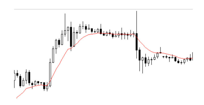
One of the most popular and commonly used methods for plotting dynamic levels is applying the Moving Average. The strength of such a level depends on the chosen MA period. The higher the period, the more reliable the line.
Additionally, levels are often represented not as single lines but as zones. This means that clusters of closely located boundaries are simply grouped together for the convenience of the user, creating areas of support and resistance.
Myths about building support and resistance
The idea of identifying and plotting support and resistance is relevant for many users. The tool is so popular that there are quite a few myths and prejudices surrounding it. Let's try to dispel them in this section.
1. Every line that can be found should be drawn on the chart. In fact, the more levels are there on the chart, the more confused the user will be.
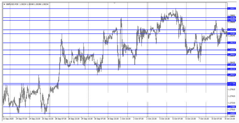
Only the most important boundaries should be plotted on the chart. They will provide guidance and a basis for further work. There may be several on each side, but not more than three.
2. Drawing lines only through the upper or lower shadows of candlesticks. It is a misconception that one should only consider highs and lows to determine levels.
In reality, support and resistance form not just lines but areas on the chart. Thus, levels can pass through both shadows and bodies of candlesticks, and there is no need to be afraid of that.
3. Using the earliest quote history data possible to build levels. Time intervals of 8 months or more may be relevant for investors who put funds into assets in the long term.
Meanwhile, this is unnecessary for traders. Quote history data for 3-6 months is sufficient enough. However, to plot levels more accurately, it is wise to choose the daily time frame.
How to identify extreme points
Price movements on charts tend to repeat. So, the past peaks and troughs can predict their future occurrence. To determine support and resistance levels, one must find extreme points on the chart.
When looking at any chart, one can notice that both the highest and lowest points tend to repeat over a certain period of time. Therefore, if the price reversed at a certain level in the past, there is a high probability of a reversal at the same level in the future.
There are several ways to find and identify the occurrence of highs and lows on the chart. Let's take a closer look at some of them:
1. Use of technical indicators. For example, with the help of the Stochastic Oscillator, one can find the highest and lowest points within a selected period and identify potential reversal points.
2. Search for isolated peaks and troughs. An isolated peak is the highest price of all. An isolated trough is the lowest price of all.
3. Use of automated programs. To find peaks and troughs on charts, specially designed tools can be applied, such as:
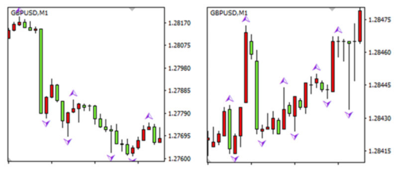
• Fractals: A special tool that allows users to identify extreme points within every five bars or candlesticks on the chart. Their effectiveness depends on the chosen timeframe and the overall market situation.
• Moving Averages: They help determine extreme points that are distanced from the hypothetical line (MA). When the chart moves away from the line by this distance, such points are identified as peaks and troughs.
Each of these methods has its pros and cons. Therefore, it is difficult to pick one. Users need to try various tools and determine the best method that suits their needs.
How to determine strength of support and resistance
Every trader must know how to identify support and resistance levels. However, users must also be aware of how to determine their strength.
The concept of strength is quite conditional and subjective, but there are some aspects to consider when identifying the most important and significant support and resistance levels.
As mentioned before, strength is determined by how quickly and easily the price chart can break through levels. Weak lines are unreliable in terms of price movement.
The key factors that show the strength of levels are as follows:
• Timeframe: Any time intervals can be used for plotting support and resistance. However, the higher the timeframe, the stronger the boundary. For example, support on the M5-M15 charts is much weaker than on the H4 chart.
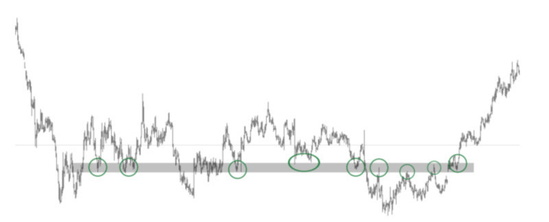
• Number of touches of boundaries by the price: It is believed that the more times the price tests a particular level without breaking it, the stronger the level is. However, there is no specific number of touches established.
• Trading volumes: The volume indicator is usually used along with support and resistance on the chart, reflecting the number of trades executed in a period of time. The higher the trading volume, the stronger the nearby level.
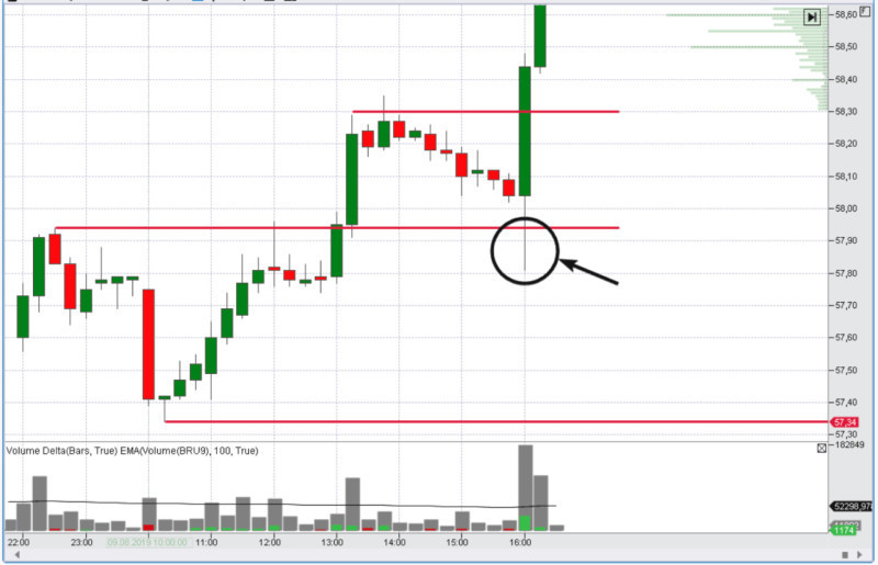
There are also mirror levels that can act as both support and resistance depending on the situation. These boundaries are essential and significant if the price chart tests them several times from both sides.
Indicators for determining S&R levels
It requires a certain level of experience to determine support and resistance levels. Not every beginner trader can do it right away.
To make it easier for users to work with the tool, additional methods for identifying support and resistance have been developed. These are special indicators and programs that detect such levels automatically.
There are numerous programs for automatic searching and plotting of support and resistance. Many of them are available for free. They can be easily downloaded and used on trading platforms.
Let's take a closer look at some of the options:
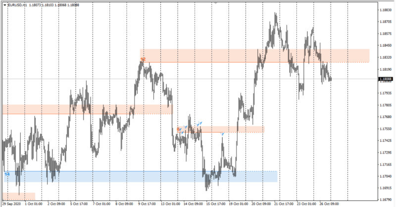
1. The Support & Resistance (S&R) indicator allows you to identify support and resistance zones on the chart. This tool is based on the fractal indicator.
The program finds clusters of such fractals and forms a support or resistance area. The more fractals are formed in one zone, the stronger the area is considered to be.
2. The Lines indicator is one of the easiest tools to use. It draws 4 lines on the chart: 2 for support and 2 for resistance. Among these levels, two are considered more significant and stronger, while the other two are considered secondary.
3. PZ Levels is a program that also allows you to determine not only the levels themselves but also their importance. All lines that this tool identifies and plots on the chart have different thicknesses: the weakest lines are dotted, and the strongest ones are thicker.
Each of the above-mentioned indicators can be used independently or together with other tools. However, before using them on a live account, indicators should be tested on a demo account.
Tips for plotting S&R levels on charts
Here are some tips from experienced traders to make the process of drawing support and resistance levels easier for users.
1. Begin with a clean chart. Before adding the necessary levels, remove all additional tools, including indicators. This will allow you to see more clearly the areas through which the lines should be drawn.
2. Start the search for support and resistance with higher timeframes. For example, you can identify the most significant boundaries in the weekly timeframe, considering them as long-term levels.
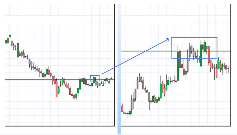
3. Continue with the daily timeframe. Traders often use the daily chart as their primary trading timeframe. Find the levels and additionally plot the lines that were determined on the weekly chart.
4..Use shorter timeframes to fine-tune positions. This can be 4-hour or 1-hour charts. Positions are often opened in short-term timeframes.
5. The primary lines are obtained from the weekly chart, as these levels are the strongest and most reliable.
6. Avoid plotting too many marks on the chart as the more lines you draw, the more confused you will get. Moreover, you will no longer understand which line to use as a reference point.
7. Never consider levels as strict lines. It is better to plot them as areas or zones. Price charts interact best with areas rather than precise lines. The drawn lines may intersect with candlestick shadows and sometimes with their bodies, and there is no need to be afraid of that.
Conclusion
In this article, we have discussed the main features and methods of identifying and plotting support and resistance levels on a trading chart. This tool is an integral part of technical analysis.
This tool is fundamental for most traders, regardless of the trading strategies they use. However, to correctly identify areas of support and resistance, traders must have specific knowledge and experience.
How to determine support and resistance?
Levels can be plotted in various ways. The simplest and most common method is drawing levels through swing extreme points. Additionally, psychological levels can be chosen as reference points.
These are also dynamic boundaries, represented by curved lines that move along with the price chart. The Moving Averages are often used to draw such lines.
The strongest levels are considered those plotted in higher timeframes. The strength of lines is also determined by the number of touches on the price chart. Volume indicators can be used for confirmation of the levels as well.
However, even the strongest levels can be broken over time. This occurs when the price chart breaks through a particular line. The stronger the level, the more power is needed for a breakout.
You may also like:


 Back to articles


